
Optimizely are in the business of helping people improve their websites so they can sign up more customers or achieve other desired results. They just raised US$57 million, on the back of US$28 million last year, and are growing very quickly. So they must be doing some things really well – so let’s take look at their own marketing website to see what we can learn.
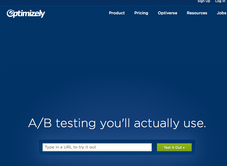
Here is the home page – which decisively answers the question of “what do want me to do?” It’s a simple question, but almost all websites fail to deliver a definitive answer on the home page, let alone on every other page.
Sadly though the next step involves a road-block pop up to set up an account, but after a couple of tries I realised it was by-passable. Once through that, Optimizely places you into something I’ve been advocating for years – a no sign-up demo mode.
Optimizely’s product allows you to edit your existing website, create new versions and then test these with a percentage of your audience. I chose Raygun.io as my target website to “improve”, with apologies to the folks at Mindscape.
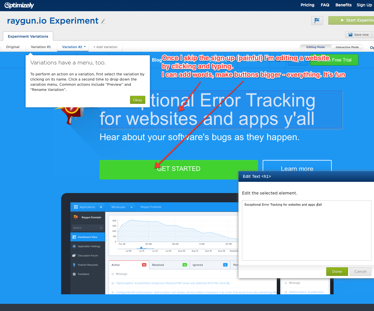
It’s a complete experience – the visitor can experience the power and simplicity of the product, set up your two or three trials, explore the options menus, and gain a lot of confidence in the product and how it works.
The pricing page, my next landing, has a lot of the standard methods used in SaaS, and it’s worth checking that your own business has these. As well as the features highlighted below, I also like the combination of simple looking pricing (nice and big) with the fine print about discounts and the 30 free days in-line for the more discerning reader. However Once again it’s clear what the page wants you to do, and I’m picking that most people will click one of the four green buttons without adjusting any of the pricing or currency parameters. 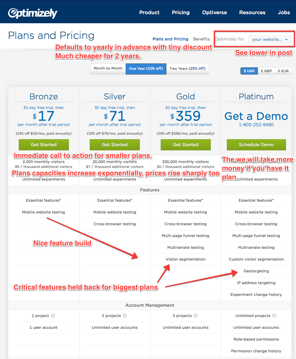
What I really like about Optimizely’s site is how they can deliver completely different experiences for different audiences. We all know we should do this, but Optimizely are unashamed in how they do it. From the top of the pricing page, and elsewhere, visitors can select who they are from a menu:
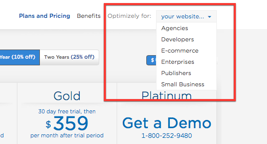
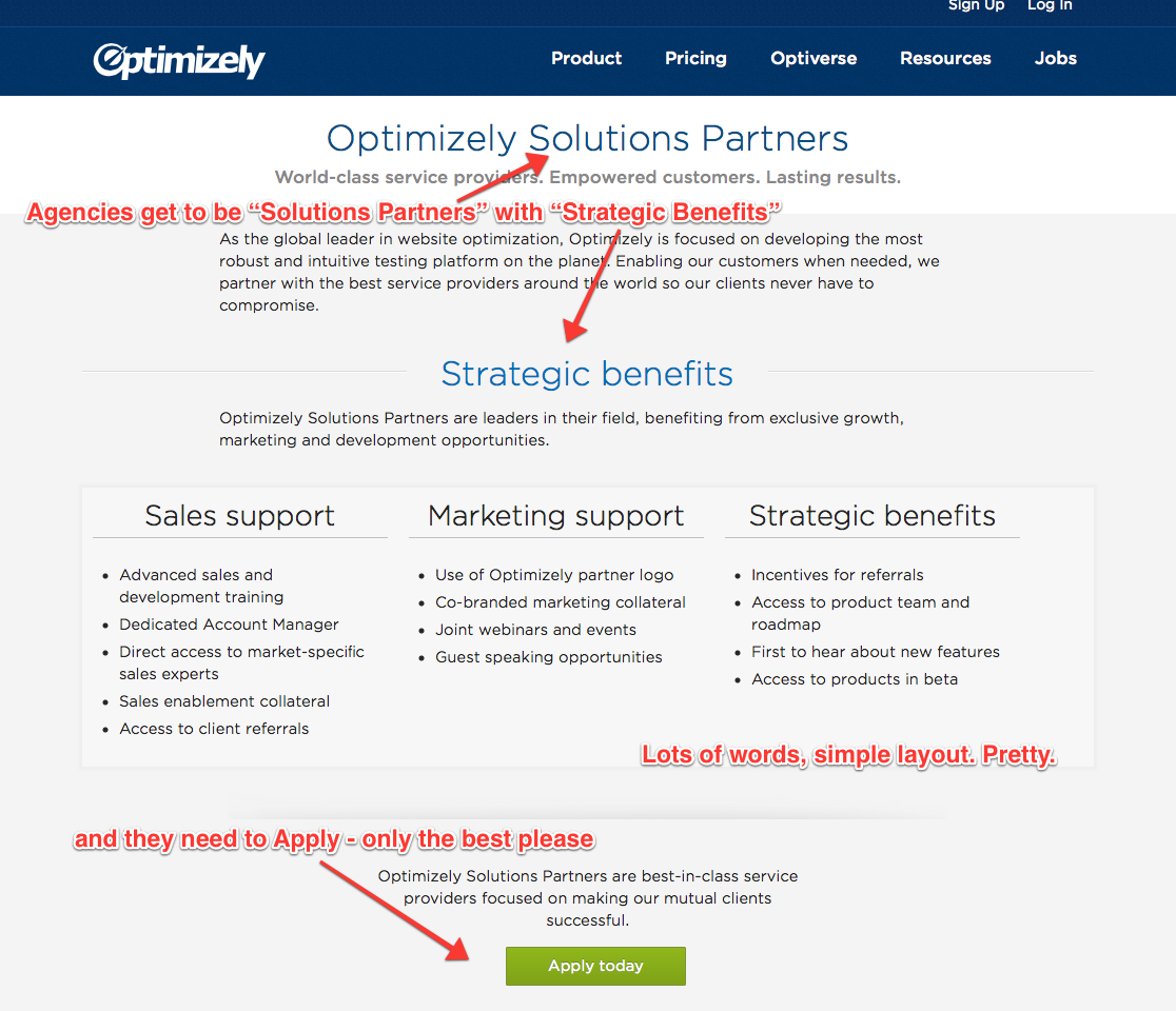
Here’s the landing page for Agencies– who get asked to be “Optimizely Solutions Partners”, and are presented with well-formatted and no-doubt well-optimised text. (I’m picking that these and other versions of these pages are also landing pages for advertising campaigns).
Next is the Developer landing page, which is very different. Even the menus have changed, losing all that marketing text, and leaving developers in their own world.
Once again Optimizely presents obvious answers to the question of what they want visitors to do – in this case the page obviously wants developers to click on one of the three boxes.
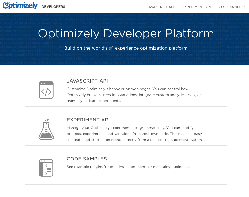
And with just one click we are in a developer happy place – looking at code:
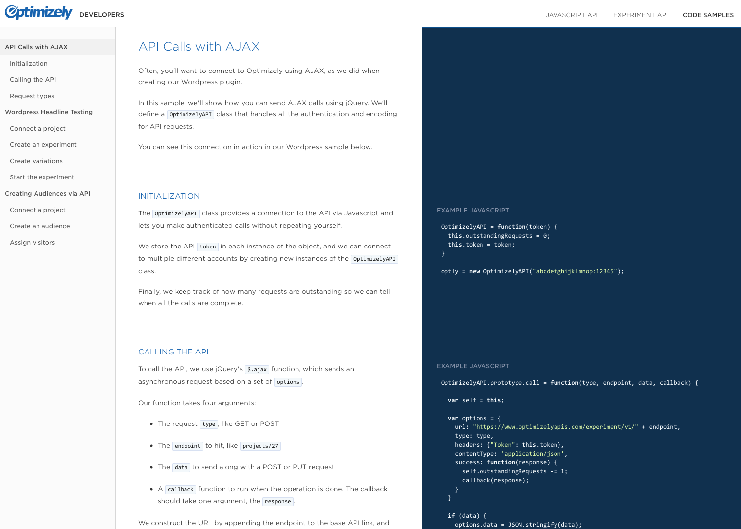
I’m guessing the marketers stay away from these pages.
Going back, here’s the eCommerce page. This page is obviously directing visitors to fill out the form – and they can expect a call or email back.
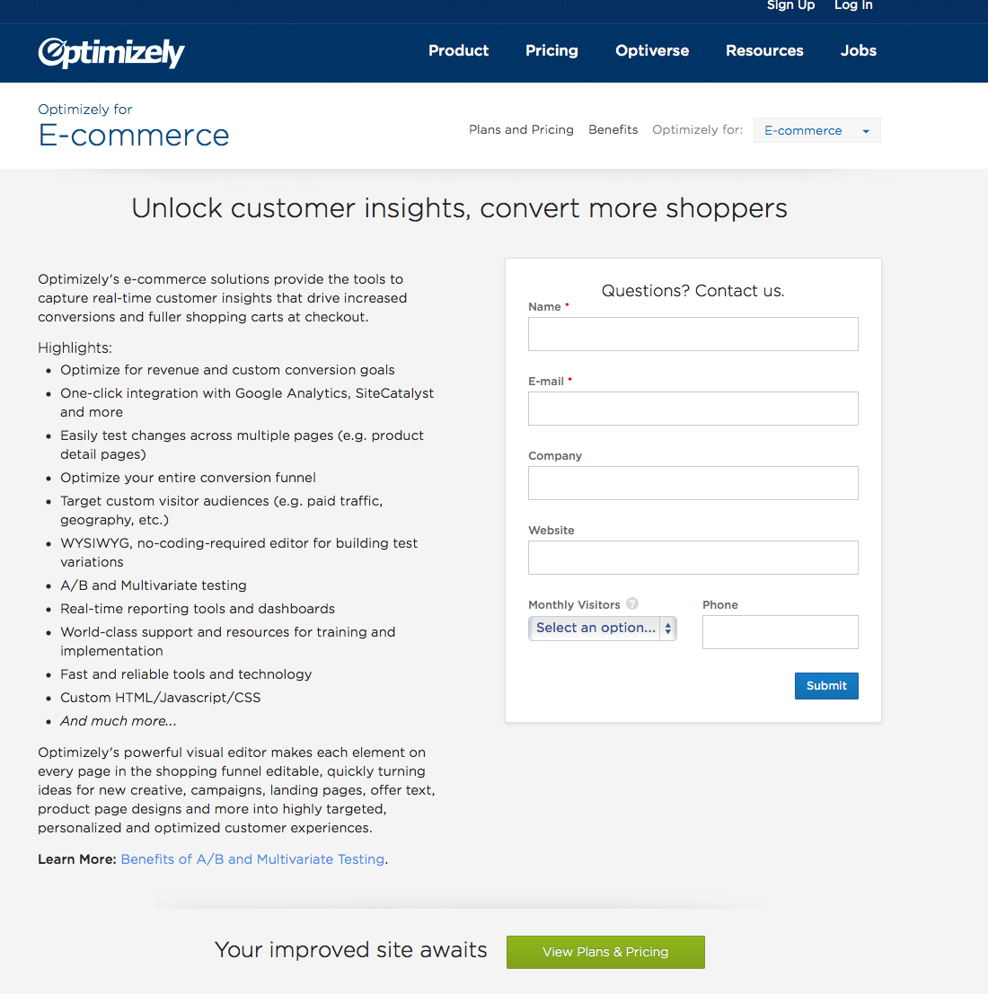
Key to this page is the “Monthly Visitors” drop down:
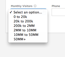
You can bet anything that visitors with larger trafficked eCommerce sites are getting a phone call back within seconds or minutes of the enquiry. The smaller ones will get an automatic response and approach, or placed in a queue for outbound sales. The outbound sales team can also pre-load the customer website provided and set up a quick demo of the product over screenshare or through the product itself. The product might sell itself, but you can bet that it’s being very professionally sold as well.
The Enterprise, Publishers, and Small Business pages are all variations of the eCommerce page – albeit with optimised text for the bullet points. The first bullet point for Enterprises, for example, is “Revenue tracking….“, while small businesses get less bullets overall, and start with “WYSIWYG, no-coding required editor…“.
Optimizely are in the business of making websites better – so there is plenty more to learn from the site. The links in the footer are another good place to explore, but I’d focus on the main customer flows into and through the website.
This is all deceptively simple, but it reality getting the flow of visitors through to buyers and then loyal customers is very difficult. The initial flow is sometimes overlooked for months, but as the accelerator for many businesses I believe it’s worth working essentially constantly.
Six things to make your SaaS website better
- Make sure it is blindingly obvious on every page what you want the visitor to do.
- Get people using your product instantly, removing all barriers including sign-ups, payments, videos, walls of text, multiple web pages and so forth.
- Provide a price and a process for every wallet size, company and customer type.
- Provide definitive landing pages and experiences for different types of customers. Be many things to many people rather than trying to be one thing to all.
- Ask for the key metric that differentiates the potential deal size for enquirers, and adjust your sales response accordingly. Go nuts with efforts for the largest and more well known potential customers.
- And it’s not here, but bears repeating: let people buy before or without registering. Once you have their money they are far more likely to want to register, and you already have their information.

In my experience, the support issues caused by a “no sign up demo-mode” are not worth it, and it’s dubious as to whether it performs better as you can’t send drip-marketing emails. My feeling is that if a potential customer doesn’t see enough value in your service to give you their email address, well, you are likely wrong about the “potential” bit.
(For issues, see “I have a new computer, where is my account?” or “What happened!?!?! I’ve lost all my data!”, etc. etc. This is not solved by a giant banner at the top of the page saying DEMO ACCOUNT, but YMMV I suppose)
LikeLike
I think in this case we can safely assume Optimizely have optimised the heck out of this choice, while at the same time they exist because every site is different and there are no “right” answers. In general I would rather the support issues than not, and if the jump-in demo is smart (there was a persistent “register now”) then the amount of data lost will be minimal.
Overall my own take would be that a sign-in free demo has to give a good feel for the product, but as soon as a material amount of prep-work has gone on then that’s got to be saved as a registration, and then as a registration demo account becomes actually useful or integral to their business then it’s time to force a paid account.
LikeLike
“then the amount of data lost will be minimal.”
There’s never any data loss – what happens is that unless you’re super clear about what’s happening, people who have already registered will click “free demo” rather than “log in”, see a demo account and then freak out, emailing you to say “What happened to all my data!?” (You point them to the login page, they use their email/password, and everything is back to normal)
So it’s a perception thing. There are also security perception issues – “Hang on, so anyone can see my data? Why is this public?”
Definitely do not underestimate the power of having the standard, simple, email/password flow that just about everyone is used to.
You definitely need a certain type of problem that you’re solving for it to working – as you say, something with minimal set-up or pre work, where the user can get value in 5mins of playing around. Keep in mind that if you’re registration-gating basically every button, the code and UX complexity will be such that you might as well just ask for an email address up front.
LikeLike