
Well we know where we are going
But we can’t see which gate it is.
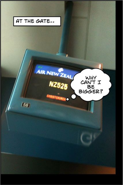
I cannot read the destination on the departure gates in Auckland domestic airport until I am quite close to the gate. This is frustrating.
So why not increase the size of the type for the destination on the gate screens Air New Zealand?
While you are thinking about it, would you please also consider a departure screen outside the exit to the Koru lounge in Auckland? That way we will know whether to turn left or right.

Try using http://www.tandemtravel.co.nz/ to book your business travel and that’s where the usability crimes really get going.
I think it’s called “Tandem” because the flight search is so bad you need to use both that site and the much better airnz.co.nz flight search, side-by-side to find the right flights and prices.
LikeLike