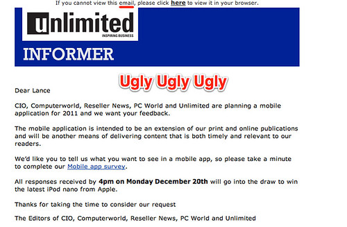
I got this email just now, it’s so ugly I thought I’d follow the link to see how bad the survey was. I took the extra time to take pictures and write comments.
The landing page as not too bad, except I couldn’t care less about adding to my nano collection, and suspect many in the target market feel the same way.
The first questions were broad. So I own lots of devices – but which ones do I view news on? The categories of apps are so broad. Perhaps it wold be better to focus on media apps, and even ask which ones I have and which ones I use. (NYTimes.com is the only one I use, and even then not very often)
The questions stayed bad – it’s actually really hard to design a questionnaire, and I suspect that the answers from this one will not be that useful. The feature list forgets that the most interesting thing is content. The payment question could lead to someone thinking that $10 per month is ok, when we all expect to pay $1 for the app and that’s it. And even the publications question – the answer it I’d probably look at all of them if they were in one app, but more important is the link to their online content.
I like the open question about what a mobile app would look like, though answers could be quite fun.
Finally the survey makes the basic mistake of enforcing the question asking for my email address and phone number. This is a great way to reduce response rates and increase bias, as evidenced by my not hitting the respond button.
So to summarise:
– We want to help, and while some people are motivated by winning prizes, most are not. So don’t make us give you our email address and phone – it feels like spam and we probably won’t.
– Focus the survey on the topic – which is a iPhone/Android/iPad app for your magazines
– Write the report that you want to result from the survey before you write the survey. This means that the answers you get will be the answers you need to fill the holes in your report.


Hey Lance. This is a subject too dear to my heart to not jump in and plug a survey guide I released under creative commons license about a year ago:
http://wp.me/Pnqr9-1p
It covers the points you’ve touched on as well as some common issues people face when they are putting together an online survey without any formal training.
Hope your readers find it useful.
LikeLike
Hi Lance
Thanks for your feedback. We can take a few kicks. I did a quick survey of the editors here at Fairfax Business Media and none of us own a nano.
Yes, the banner looks pretty ugly but we’re working on that and your post will come in handy to get some action.
We have a pretty good idea of what we want from talking to a lot of our readers but we thought a general survey would pull in some more information that we hadn’t thought about.
The survey is across five titles from the Unlimited audience to PC World, and those geeks at Computerworld, so it has to be broad but we have taken your points on board.
Cheers
Mark Revington, Editor, Unlimited
LikeLike
Hey Mark Thanks for standing up. I can sell you an old nano if you like ;-). Glad the post will help spur action
LikeLike
One more thing you’ve missed picking on! The radio buttons are bad. If you click that you own an “ipad” then realise you’ve misread and thought it said “ipod” you can’t untick it – you’re stuck with either owning it now, or planning to purchase.
LikeLike