Codswallop from the NZHerald

Valentino’s Gelato somehow got rated ahead of Giapo as the best Gelato in Auckland by the NZHerald. What codswallop.

The reviewer, Nici Wickes, raved about Valentino’s “Moro bar and Bounty bar” flavours. While that might be a fun way to pack on the pounds, those flavours invoke a reflex gag for me, and certainly are no part of a decent gelato selection.

The review does at least give a nod to Giapo’s “creations … crafted fresh every day using organic ingredients, free-range eggs and New Zealand seasonal fruit”. However it goes well off track when mentioning “music pumping, people doing impromptu karaoke”, neither of which has been a feature for, oh,  a year maybe two.

Giapo’s Gianpaolo Grazioni has certainly calmed down the atmosphere at Giapo since launching almost 3 years a go. I was critical then, but the relentless improvement in the quality of the gelato is difficult to beat. I suggest the NZHerald reviewers either visit the store during so-called Karaoke times or at least fact-check their sources next time.  And I suggest that we all continue to vote with our feet. Giapo is full even in the dead of winter, and is an increasingly must-do tourist destination.

Data for iPhone in NZ: the summary charts

Looking to actually use your iPhone as intended? Then you’ll need data, and l0ts of it, especially if you want to abandon the mobile data sticks and tether your phone to your computer when travelling.

I’ve run the numbers from all three major suppliers, and assumed that you’d buy the best deal, and that you correctly project your demand when you do so. The charts below ignore the various values of text and voice in the plans, and show the cheapest way to obtain data under each of the three carriers.

For data consumption under 3GB – Telecom is the winner, with Vodafone close at 500MB and then beating out only 2Degrees for 2GB or less.

But what if you use more than 3GB a month, as I often do?

Telecom is cheapest again (using their 2GB+4GB add-on plan), 2Degrees is next (using their nationwide plan which costs $100 per extra 1G), while Vodafone is most expensive (using the 500MB plan + 1 GB addon plan.) Vodafone suffers badly as above 1.5GB it has a punitive rate of $200 per 1GB.

Going forward our data use with iCloud sharing photos, Siri, Dropbox, movies and tethering can get pretty large. Mine is tracking to go over 6GB for this month – so let’s see what the damage is:

That’s 15 and 20GB on the right hand side, so don’t panic, and equally don’t expect to use your mobile phone as a replacement for your home data. (My home plan is 150GB a month). But if you are a heavy data user then right now Telecom is the place to be, up until 10GB, which is when their punitive rate (10c/mb) kicks in. Above 10GB you’d be smarter to sign up to another plan and wield two phones or sim cards.

So while Telecom is cheapest now, whatever you do don’t sign up to a contract. Your use will change a lot over the next 2 years, and so will the prices in the market. The rebate you get on a phone is small compared to month after month of restricted service or very high data charges versus competition. A few hundred dollars now might cost you a couple of hundred dollars a month down the track.

So go ahead and get an iPhone, but sign up to a month by month deal, monitor your usage and adjust the plan and supplier regularly.

Vodafone’s iPhone 4S plans seem to have forgotten data

Vodafone released their iPhone 4S plans, and I feel very disappointed.

Vodafone have a superior number of Texts versus Telecom on all but Telecom’s most expensive plan, which matches the 2500 texts.

Their voice… well who cares. Forget about the worrying ‘no plan transfers’ as well, and head straight for that data line. The maximum available is just 500Mb per month, with a $20 1GB add-on to take it to a real maximum of 1.5Gb a month. Telecom’s maximium data per month on iPhone is 2GB with a 4GB add-on for $80 plus another automatic 4GB for another $80, all of which which is 10GB of data a month before punitive rates set in. It’s not even close, indeed it’s an order of magnitude.

That 1GB data add-on is free for the first 6 months, and at $20 for 1GB after that is at an equivalent rate to Telecom’s 4GB $80 add-on. It’s a reduction from previously, where 3GB was included for free.

However the biggest failing is that it is only possible to have one add-on at a time.


It’s worse.

[I cannot (yet) find the data charges once you go over your limit. This makes or breaks Vodafone’s plans, as if the charges are pro-rated then they are on a winner, but if they are punitive then they risk losing tremendous goodwill.]

Thanks to Twitter and @matt_tong I’ve finally found that the punitive rate is $200 per GB (quoted as 20c/MB). I failed to find it directly but it seems simple now it is pointed out to me – this is for the largest plan. We find the usual penalty rates, and an incredible charge for video calls, which I hope is not Facetime, but am deeply concerned that it is.

Why so low?

I’m not sure why Vodafone have done this. Perhaps they are using their own data calculator. Here’s a reasonable one I did for myself. It missed several large categories of data use.


Here’s one I did for just web browsing. Let’s ignore youtube and everything else, and just think about web browsing. I plugged in 24 hours of web browsing a day and nothing else, and got back a result of 4.8GB.

However browsing for 24 hours a day, with say a page every 2 minutes results in 720 pages a day, or 21,600 pages a month. If each page were about 0.5 MB, for simplicity, in that time, so that’s about 10,800 Mb, or 6.3 GB if I were really browsing for that time.

Here are the data packs avaialble to buy. I’ve calaulcated how many pages that equals per month at 1MB per page.

The other plans are amusingly quaint. So it seems there is a bit of a disconnect here – the calculator is behind the times.

Overall

This stuff makes me angry because these low data caps are a self-fulfilling prophesy. When we have low caps then we use less data, and so carriers will provide less as a result. While I’m an advocate for high caps or no caps, it’s sad when there is no large usage plan.

It’s not about the voice or texts any more – it’s the data, and while Vodafone has to pay Telecom for their international and backhaul, it’s us the consumers that are suffering from these caps.

A closer look at Telecom’s iPhone plans

It’s great for Telecom that they now have iPhone distribution rights, and that’s also great for competition in the marketplace.

However I do recommend that you look closely at the fine print in their plans and be careful about your approach.

1: If you want to have the maximum amount of data then it seems like you will need to buy 2500 texts and 500 or 650 minutes of calls [edited to correct flipping of calls an minutes – thanks to @silentTracks]. There is, however, a better way – below.

2: The maximum amount of data on offer is just 3GB. I used 6.6 GB in 10 days in a recent trip to Australia (thanks to Dropbox mainly), so if you tether and travel a lot then this could be exceeded. Even without tethering iCloud syncing over 3G will have a decent impact on your data use.

I strongly believe that we should be able to use all of our internet enabled devices with no regard to limits, and when we do so it is transformational.

3: If you were to use 6 Gb in a month then you’ll be paying the 10 cents per MB, or $100 per Gb rate, so that’s an extra $300 on your bill.

3b:  The iPhone automatically switches many texts onto iMessage, so even if you are sending 22 texts a day then your usage will drop. However if you are under 20 (say) and send 50 texts a day then expect sticker shock as the texts above the limit will cost 20 cents each (although the table above says 20c/min). In this example the extra payment would be $170.

4: If you want to call international then it’s better to use data and something like Skype. It’s amazing that charges of 91 cents or $1.43 a minute are thought by Telecom and other carriers around the world to  be acceptable these days. They are not.

Next are the terms and conditions.

  • They show that the lessor plans have a more punitive cost per megabyte, so using an extra 3GB will cost you $600.
  • Pxts will cost 50 cents to other networks, 20 cents to Telecom phones. Using iMessage will make this free.
  • I’m not sure what a data boost is, but at $200 per Gb I certainly don’t want one
  • Voicemail costs money, and early disconnection fees exist but are not stated


Overall I’m very disappointed not to see a data intensive plan that has less text and calling. The bundling approach used is a deliberate attempt to hold on to those traditional revenues, but I am concerned that Telecom’s plans don’t reflect that iPhone users spend the vast majority of our time using apps or data and only a little bit of time calling or texting.

However there is a solution – though you’ll have to dig around for it. Telecom offer “boosts” for all post paid plans, and you can add 4 Gb to any plan for $80.

If you exceed the 4Gb then you automatically get another 4Gb for another $80 (after which it’s back to $100 per Gb). This means you can tether for a much more reasonable price and get ride of any mobile data sticks and so on that you have.

I have this plan, and while I have yet to kill off the stick plans, I get by very well by only tethering.

However I have no idea how to add this plan to the pre-ordering for iPhone, and do not even know whether it will be possible to add to the plans.

If so then the recommended approach for a heavy data iPhone user (aren’t we all) would be to choose one of the lower plans (the $120 one say) along with the $80 data pack.

[update]
@Bandit has directed us to the Business plans, which appear cheaper at first. However they are all priced before GST, and to my eye look similar to the consumer plans for data. They seem to have dropped the number of texts and increased the minutes versus the retail plans, which makes sense, but data is still priced the same.

I can’t find the add-ons page for the $80 for 4Gb deal, but I did find this shamefully priced extras piece on the “business share” page.

Those internet overage rates are $670 and $440 per GB, so my extra 3 Gb example above would cost me just around $1300 or $2000 each month. These are wildly unacceptable.

Give the customers what they want NFL – the All-22

From the (paid) Wall St Journal a fascinating article on the “all-22” view for NFL (American Football). The all-22 (there are 22 players on the field at once) view is the top down wide angle HD view that cameras capture in every game, but which is only released to the NFL teams themselves.

If you ask the league to see the footage that was taken from on high to show the entire field and what all 22 players did on every play, the response will be emphatic. “NO ONE gets that

NFL is a highly structured game, where highly choreographed attacks and defenses move all 22 players across the length and width of the field. The off-field coaches are the ballet masters, and almost without exception, call the plays. But sometimes those plays are the wrong ones, or the structure of the attack or defense is poor, or the execution of the play by a team is poor.

The All-22 shot would make it a lot more obvious what is actually going on in the game, and make it a far more compelling viewer experience. It would also make it far easier for players and coaches at all levels to understand how the elite teams go about their business.

But still the NFL resists:  “This is a long way from becoming a reality, if ever.”

They are quire wrong. While the all-22 view would expose poor coaching and plays, that exposure is exactly what is required to lift the quality of the coaching and plays. The NFL also admit that customers (viewers) really want to see these views but they are concerned that TV and amateur analysts will spend hours pondering the footage. Again this exposes the short term thinking of the NFL, and a distinct lack of courage. The analysis they are so afraid of will lift interest in the game, increase viewer hours and ultimately increase the ability of networks, cable and websites to pay for the rights in the first place.

How is any of that bad for the game?

As for the sport itself?

By distributing this footage only to NFL teams, and rationing it out carefully to its TV partners and on its web site, the NFL has created a paradox. The most-watched sport in the U.S. is also arguably the least understood.

In summary this is a beautiful example of short term revenue-focus stupidity trumping what is best for the customers. Like other businesses with myopic focus the end game is obvious.


NZ is a magical place – except for the lousy internet

Rob Schnabel from the US is visiting – and has something to say:

I have a young business based in New York City. I create street wear inspired by rugby. [The site is bakline.com] I arrived in New Zealand for the second half of the Rugby World Cup – a massive event for a rugby-crazy Yank like myself. My mission is to explore the market and look for opportunities beyond what the virtual web can give you by simply searching Google. You have to live the culture to understand your customer and chances in that realm. New Zealand has a lot of promise for my brand.

I come from America’s epicenter of the urban way of life. Arriving in Wellington was a small state of shock and further more by the time I arrived in Blenheim, just a hop across the Strait on the south island. The area is what I heard about and more. The environment is lush with sun, farmlands, fresh air and ocean breezes. What I did not expect was the lack of efficient speeds of internet usage. This is a big problem for my trip abroad because it retards my timely communication back home both personally and for business.

My usage needs are simple. I work heavily in graphics and social media that require breezy speeds to explore (stock sites), downloads and uploads (graphic files) and streaming videos (social media). Upload and downloading speeds are painstaking at times and browsing pages for both research and entertainment is laborious when trying to work quickly and efficiently. The spotty bandwith at the local library doesn’t allow dependable Skype calls to take place and costly to work around. This isn’t the case with all of New Zealand by no means, but a problem still depending on how remote you travel. I wonder what someone from Japan thinks when they travel abroad and use the internet in America for example, bandwidth in Japan is crazy fast and they have sites that take eons to load even in places like New York.

It’s tough to criticize when you’re out of your comfort zone. Discovering differences is part of the beauty of traveling. But when doing business abroad while trying to seal deals and make ends meet gets jeopardized by basic communication, you have an obstacle to work around and overcome. New Zealand is a magical place. Warm people, environment of mythical proportions and a 1st rate traveling opportunity for anyone. I’ve met many backpackers in a short amount of time and most of them are starved of keeping in touch with family and friends back home – and I for one, am debating my time spent here because I cannot jeopardize my commitments back home because of bandwidth – but it sorta is and it’s unfortunate.

By no means is this a gripe or a stain of my impression of New Zealand. It’s food for thought if New Zealand wants to advocate more global integration by having the means to let travelers work more effectively while on holiday or conduct business in the most exotic of locations. It can only be a plus for everyone involved and benefiting.

Solving the Whale Oil problem

Cameron Slater is certainly on fire today, releasing a load of posts on his blog.

His blog, while not to me required reading, is certainly on the radar of most politicians, and he has pulled off several scoops in his time online.

However at the same time he has had “the black dog that is severe depression“, making him unfit for many years for normal work and surviving on the benefit or insurance payments. I’m very pleased to have found out now that he is better, to the point where he wrote in August that he is now back at work.

That’s great to hear, as it solves the Whale Oil problem for one person. However the problem remains for many – how do we as a society help people get off the benefit and on to paying work. It was doubly hard in Slater’s case, as he is clearly very capable, and commands a significant audience, and the optics of a ful time political blogger on a benefit were disturbing for all observers.

Reforms to welfare benefits announced today seem to signal a smart change in approach.

The new policy, which is admittedly light on details, aims to flip the approach to benefits from “entitlement to service if you fit a category” to  “helping people deliver on their capacity to work”.

The emphasis of resources (training courses, 1-1 assistance, child care and the like) will be to support those people most at risk of being long term off-work, rather than those who just happen to be between jobs. Time will tell, but I hope that this means folks that are in the position Slater was will be given the nuanced and targetted support they need to get back to work.

It’s been released as a National Party policy, but reads as a government policy, and contains some simplification of the complex benefit nomenclature as well. I hope the other partie get behind it (or similar) as well.

Mapping your Linked In connections

Linked-in inmaps seems to accurately cluster the people you are connected to:

Hit the link and login with your Linked In account and it will churn away, producing the pretty diagram. The fun is in mousing over the dots, especially the ones on the edges and between the clusters.

But while it’s fun, it’s not really useful. Moreover I’m still short the stock of Linked In itself, which I believe is wildly overvalued.

Top lessons from Steve Jobs biography – it’s the products

Reading Walter Isaacson’s Steve Jobs was a privileged look into the life of a very special individual. It certainly completes the picture of the man that has emerged with increasing rapidity over the last years and months.

In the spirit of what he stood for, here are what I see as five of the the key lessons we can all take to heart. These start and end with creating great products.

Seek to change the world by:

  1. Striving to create awesome products
  2. Focusing on a very few products at once
  3. Selling only products you are proud of
  4. Cannibalizing your own products if it puts the end users first
  5. Setting the standard by being your own toughest customer

Apple itself exemplifies these.

These are each extraordinarily difficult to achieve, especially within the confines of a large company. In achieving these for Apple and Pixar Jobs was a mercurial task master, and was often brutal on people, although they often remarked much later that he brought out the best in them. Staff, especially at Pixar and NeXT, learned to filter his outbursts by de-amplifying the intensity of the message delivery mechanism and listening to the intent behind it. Over time he softened his personal attacks, though never completely, and focussed as he should on the person’s output.

These philosophies can apply to almost everything – to companies, political parties and even to us as individuals.

Another way to look at the lessons list is to understand what they do not mean. Here is an anti-list of lessons, the list we should all strive to avoid.

Have no clear customer cause and:

  1. Focus on making money, building a company, or creating a ‘brand’
  2. Cover the shelves with your large breadth of product varieties
  3. Sell anything that makes money
  4. Delay introducing new products to maintain the cash cows
  5. Use focus groups to approve product concepts

Imagine if some traditional players took the lessons from Jobs and Apple. Why – we could have:

  • Telecommunications companies that deliver all you can eat data for one price across multiple technologies (phone, home fibre and DSL, metro wifi and international);
  • Political parties that agreed on almost everything and focused on fixing the problems, and having considered fact-based debates only on the few things that mattered to their own philosophy;
  • A selection of five different rather than 100 similar toothbrushes at the supermarket, making it easy to choose and move on;
  • Food packaging that is simple for 80 year old grandmothers and their grand children to open and close with one hand;
  • Publishers delivering us their content simultaneously across all media for a single all-inclusive price;
  • Banks that help individuals save rather than excessively borrow money;
  • Power companies that provided us with the information and tools to conserve energy rather than use it
  • Airlines, airports and taxi companies working together to half overall travel times and improve the experience

and so on and on and on. We can show examples for some of these, but countless examples of the reverse.

Jobs couldn’t for years bear to own anything that wasn’t beautiful, and his house was sparsely furnished as a result. He was a champion of design that democratized beauty – so that great design wasn’t just confined to the 1%.

Steve’s philosophy as popularized by Apple’s success lives on. Today we see not just Apple’s products everywhere, but also countless other products that are heavily influenced by Apple’s design leadership and design thinking philosophies.

As customers we increasingly no longer need to compromise – we can demand beauty, sustainability and perfect function in everything we buy.

That is the legacy Steve Jobs has left us.

Thank-you and RIP Steve Jobs, and thank-you to Walter Isaacson for a wonderful portrait of his life.

This is not a serious post – unless you want to be Trade Me CFO

Trade Me likes to ask candidates for jobs to perform a task that should be simple and fun for the applicant. For the CFO they are looking for it’s to do the following:

Now the idea of calculating how much money Trade Me makes may not fill most with a sense of fun, but I have to confess it’s something that I did for fun way back in the day, and then did for real while working at Trade Me. We liked to ask potential business oriented candidates how much they thought Trade Me was worth – but the usefulness of that question fell apart after the sale.

But the wording is a bit iffy on that ad. I’m confused – do I include a photo of me on the back of an envelope with the working of how much money Trade Me makes?

or do I take a photo of an envelope which has my workings on the back?

or do I just put any old photo on the back of an envelope and include my workings?

or do I include a photo of an envelope with workings on the envelope inside my CV?

Whatever it is I feel that this is a test I would fail spectacularly (and now have). The model bit is easy (it’s the one in the pictures) but the instructions are a nightmare.

But if you can figure it out, and are qualified, then I would recommend applying for the CFO role at Trade Me. There’s an IPO to get through, quarterly reports to the market and all sorts of awesome people that work there.

Updating stats on data Caps in NZ

Stats NZ have released their latest ISP survey results.

We still have data caps, and they are still relatively low.

The results show that 1% of of homes and businesses have no caps, 2% have >50GB cap and 28% have 20-50 GB cap.

For comparison in the April-June 2011 quarter the average amount of data used (not the cap, but used) in Australia was 15.7 GB per month per fixed line subscriber. (47 GB over the 3 months).

I would argue that a cap of under 50 GB is not really broadband – but I tend to be a bit more demanding than most. Thus by my measure only 3% have a decent cap where they can use the internet without thinking about the consequences of data usage.

Those Australian 1 TB consumer plans are looking quite nice – I wish we had those here.

The NZ election websites

There’s an election on – so how are the parties doing based on their website design?

(Click on pictures to see larger versions)

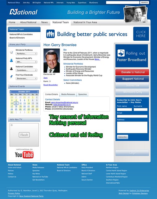
National is stuck in the past, cluttered but have a very crisp business-like approach. No glitz and glam here, though they do want to play videos at you.

The site feels old – and Enlighten Design needs to pull it into shape.

Their list of MPs is long long long, but at least it’s easy to find the one in your electorate. (click to view snark comments)

The page per MP is pretty stark and businesslike. No personal anecdotes here.

Labour has entered the new age with their simple approachable website – above the fold at least. Well done &some and String Theory and certain sub-contractors I know well.

It all gets a bit messy as you scroll down though.

And “Maryan Street” isn’t looking too flash:

The worst is that clicking on the MPs tab brings you into the previous generation website. It’s like a parody – only it isn’t.

The descriptions for each MP are nice and verbose, albeit in the old format and without any structure. I’m not going to read it.

The Greens are cluttered – and very Green. I like that they don’t use flash. However the news section is just too busy so I’m not going to read it.

They only have a few MPs listed – there’s an election on you know…

The ACT website homepage is long on people and short on policy, which is not going to win my vote. Not that they would anyway.

The Maori Party website is strong – but the homepage is policy free. I guess if you have to ask then you are in the wrong place.

What we want

We expect websites to have deep information, but show the important information up front. We exepect not to have to think about what to read or do when we arrive at the website – lead with your best shot.

The key content should be easy to find – decent bios of all MPs,  the policies the party is campaigning on, the deeper policy statements and where I can meet my candidate.

I, like many others these days, don’t drive much, try not to look at billboards when I do drive (a motorbike) and don’t really read the paper or watch normal TV. So a decent website is pretty much the only way for me to find out about the parties – and overall I am really left in the dark.

But there are still 46 days and a Rugby World Cup between now and election day. Plenty of time.

Mining in Antarctica

I’m somewhat surprised to see the NZ Government reported as the ones to place the thin wedge on exploitation of Ross Sea.

“New Zealand is set to veto any attempt to completely protect the world’s last unexploited ocean –  so a lucrative fishing industry can continue operating.

An official New Zealand document leaked to Fairfax reveals Wellington, backed by the US, does not want the whole 650,000 km2 Ross Sea declared a marine protected area (MPA), despite a 25-nation convention saying it is “of high global importance”.

Maps in the document written by the Ministry of Fisheries show a large area of the Ross Sea is excluded from a marine park. It means the fishing industry can keep taking toothfish, discovered by New Zealand in 1996, worth $18 million a year.”

What this does is lose the moral high ground for New Zealand when the inevitable conversations start about exploiting the other assets contained by the Ross Sea. I refer to, of course, oil.

South Korea, using a Lyttelton-based icebreaker, will next year begin building a $120 million base at Terra Nova Bay, 300km north of New Zealand’s Scott Base.

New Zealand’s claim to the Ross Dependency was suspended with the signing of the Antarctic Treaty in 1959 which also demilitarised the continent.

That treaty expires in 2048 and with the Ross Sea suspected of being one of the world’s largest oil reserves after Saudi Arabia, pressure is already building over what will happen when the treaty expires. Korea’s patriotic base name, following China’s new bases with nationalistic titles, hints at possible territorial claims, according to a paper written by Sydney’s Lowy Institute national security fellow, Ellie Fogarty.

So let’s put this together:

  1. New Zealand has only moral not formal authority over the Ross Sea due to treaties that we have signed;
  2. We are pushing for the Ross Sea to be partially opened up to fishing so that we can earn $16 million per year;
  3. The Antarctica treaty and Madrid Protocol banning mining expire in 2048;
  4. The global powers will be different in 2048 than in 1959, particularly the rise of ASEAN countries who have no representation in Antarctica, though there is a nice slice of unclaimed territory;
  5. The Ross Sea is apparently where all of the oil is; and
  6. Oil is going to be incredibly precious in 2048.

I am not denying that we can’t environmentally safely find and obtain the oil from the Ross Sea in 2049. It would be a very expensive task, but entirely doable if the price of oil were high enough and the global demand required it.

The demand will be there, unless we get global green energy and fast. If wars are being fought now over oil, then what will the tensions will be like in 2048 without change?

New Zealand finds itself stuck in the middle of all of this – and part of me wants to advocate the expansion of the fishing boundary to accept precedent that this is New Zealand’s land to exploit (and our profits), but the better part of me says Stop – let’s keep Antarctica pure, and let’s keep that oil off-limits.

It’s time to learn more – and for that reason I’ve signed up to OurFarSouth, and am taking a month out in February/March 2012 to travel with a bunch of other disreputable characters to Antarctica, stopping by a few interesting places along the way.

These opportunities don’t come by that often, and I’d encourage anyone thinking about it to grab one of the last three places.

I’m going to help stir things up by presenting the case for mining in Antarctica –  a lone voice in the wilderness. Hopefully it will incite a great conversation and I won’t find myself playing in the water with Happy Feet.

Even better the trip, led by Gareth Morgan, includes a host of experts on the region and other folks that are committed to communicate the delights of deep South NZ to the country. It’s going to be great.

Road deaths are not so bad


Microsoft Excel, originally uploaded by LanceWiggs.

Despite our small population density, horrible terrain and fickle weather New Zealand is actually doing pretty well on the road deaths chart versus peers.

There is a lot more nuance in the stats, which should really be by passenger mile and take account of the presence of pedestrians, but it helps to look up sometimes and say we are doing ok.

Now – back to work. No death on the road is acceptable, and we need to get to Zero Harm as soon as reasonably practical. Zero Harm on the roads inevitably means taking away control from drivers and making all vehicles at least semi autonomous for the most busy roads. That will increase the allowable density of traffic, remove once and for all the issue of drunk driving and turn unproductive commuting time into productive commuting time.
Meanwhile please stop putting up those motorcycle killer wire safety barriers.