Buyers and Sellers guide to Web Design and Development firms

A few weeks ago I requested visits to Auckland Web design and development firms, receiving a healthy range of responses. I didn’t get to visit everyone, but thanks to everyone who replied, and to those who suffer my visit.

I managed to get to, in the self-imposed two-week deadline, 11 companies: 3Bit, Marker Studio, OnFire, Pitch, TheWebCompany, Studio Alexander, Silverstripe, Young and Shand, Gravitate,  Swaytech and Starsoft. Thanks also to Lee ter Wal Design, whom I work a lot with and also recommend. I have emerged far more knowledgeable about the scene in Auckland and the business in general, and am impressed with what I saw.

Every firm had strengths which lent them to a particular niche, or made them better for a certain kind of client. At the cheaper end the game is about selling to clients who are fairly unsophisticated, and while the websites are fairly basic, their main service to us all as end customers is in actually getting their clients to have a half decent website in the first place. Many of those clients will later graduate to more sophisticated websites and development companies, and these early experiences will set the tone.

At the very top end firms are performing complex work for high traffic sites owned by very large businesses. And stretching from the bottom to the top are a vast array of firms (over 800 in Auckland I am told), from small, medium and large generalist firms, to firms of all sizes that are stronger in one area, such as heavy duty technical work, branding or marketing.

Despite the competition, there are thousands and thousands of local and not so local businesses demanding quality work. Businesses understand that websites are critical, and a little sales effort and a record of quality work will help you find them.

There are a number of ways that I can sum up what I learned, and I’ve settled on this:

The Buyers and Sellers guide to Design and Development firms in Auckland.

Buyers Guide

Designing and building a website can be done at a range of costs and benefits:

  • $3,000–$5,000 will get you a very basic WordPress website based on a pre-existing template. It will be roughly acceptable but probably not inspiring.
  • $5,000–$15,000 will get you a well-designed functional brochure-ware website. You’ll use a smaller, younger firm to do so, and you’ll need to be very clear on what you want. This isn’t the time to iterate too much, but you should get something that represents your small business well.
  • $15,000–$50,000 gets you a well-designed website with a degree of capabilities. It may include eCommerce, or even hook into one or more of your legacy systems. These are for growing and medium sized businesses, and are well worth the investment.
  • $50,000 and above, and that can be over $1m but is typically $100-200,000, gets you a range of websites/updates for serious businesses. This is a space populated by advertising agencies running multiple campaigns, or large companies with very complex requirements and legacy systems.
  • Anything over $200,000 and you should be working on the principal website for a huge business (by NZ standards). If you are paying more than this for a marketing website then you should let me handle it and I’ll split the difference with you 50/50.

Prices

Firms charge between $90 and $200 per hour to external clients. $120 is the acceptable limit for an up-and-coming firm, while $120–$150 is what most professionals are charging.

If you are paying $90 to $120 an hour then you are either very lucky, or you have ordered up thousands of hours of work in advance. For those huge commitments you may pay low rates, but be prepared to enter into a binding contract, as the biggest shops make money on time and margin, and with lower margins you need longer commitment.

If you want (or are) one of the smarter eggs around and can do complex work that others can’t, and incredibly quickly, then look to $150 and above for the right rate. Like a great mechanic they will make it up in time saved and better results.

Note that these are prices firms charge to end clients. Retaining an individual directly or is often cheaper, though you may not get the same time commitment. Firms that are selling services to clients at one rate do need to make a fair margin on any contractors they hire, and also need to be amply compensated for the overhead, risk and brand strength that comes with a larger more established firm.

Intermediation

The industry is in parts very fragmented and layered, with some specialist firms receiving work from agencies who in turn hold relationships with clients. Sometimes there are three or more layers, and I wonder whether the end-clients even know about the people who do the actual work.

I must sound a warning here. Retaining a master agency who then retains other firms is a very good way to spend a lot of money and get a lousy result. This layering pushes the end client further away from the designer and developers who do the work, and it becomes a game of Chinese whispers.

Meanwhile the client may have internal ‘run by committee’ issues, so that multiple voices from agency, development and design firms and clients are driving the results. The results are generally a mess, and a quick scan through this blog will show a few of them. Ferrit is a classic example. A large number of people and firms were associated with that disaster, yet very few are willing to acknowledge that now.

The new digital agencies are pretty good, but I would recommend that you understand and stick to what they are good at, and retain direct relationships with firms to fill the gaps.

Good clients

As a client you need to get a range of tasks done to build and maintain a great website, and not every firm can do everything well. Choose between an integrated firm, one that can outsource some pieces to others or choose individual firms yourself.

However you also need to make sure that you are a good client, as only good clients can help firms make great websites, and deliver excellent business outcomes.

  • Good clients have a defined mission, vision and values for their company, which will guide the purpose and design of the website. If you are not certain of your mission, vision and values then the project will almost certainly fail. Seek help from a business or branding consultant if you have not done this step, and everything thereafter will become a lot easier. I’ve been exposed to this sort of work many times over the years, and in NZ have worked with Ray Labone, founder of Designworks, who has done this for dozens of decent sized NZ companies.
  • Good clients also have a brand strategy, based on the above and on awareness of the positioning of their company and products in the market including  with users. If you have not done this, then seek help from a branding firm, making sure you understand what they need to be briefed. Ray Labone and Grant Alexander are both excellent choices for this sort of work, as is Brian Richards (BRR). Grant, is also part of our Equip BBD team with Ray, while Brian and BRR have their own team delivering Better By Design work.
  • Good clients are clear on the purpose of the website, which build from the mission, vision and values, the brand strategy and a healthy does of business strategy. Great web development firms will help you tighten this up, but make sure you are aware of the need beyond “we need a new website” before you engage.
  • Good clients know what good looks like – they have favourite websites, understand what competitors are offering and have strong yet flexible ideas on the feel of the website.
  • Good clients listen to great designers, knowing when to step back and the the design process take its course. Jumping in too often can lead to poor outcomes, but leaving it all up to the designers can lead to poor business outcomes as well.
  • Good clients have one point of contact who is responsible to the business for the website. That person is ideally a nerd, designer and business person combined. The design process takes input from others in the business, but the final outcome has to be driven by this one person, not by a committee, and not with anyone else having a veto. If you want a veto, then get involved. And sorry, not every product or division, or indeed almost no products or divisions, gets to be on the front page.
  • Great clients allow developers to use an iterative approach, and expect to hear words like “sprints”, “weekly reviews” and “ship”. They have an over-arching scope, but are happy to pay on a time and material basis versus an estimate.
  • Good clients don’t dramatically change the scope, dither for too long on decisions or go out of contact for days.
  • Good clients allow the time and money for the firm to use the appropriate design tools to deliver a high quality product
  • Good clients form lasting relationships, understanding that websites need constant maintenance and development to stay fresh and usable.

Sellers Guide

While a track record is your best sales promotion tool, I observed that too many firms rely on word of mouth to generate sales. That’s great when it works (it works for me), but I strongly encourage all firms to have a sales strategy that is a little more mature. You may decide to blog, attend conferences and do stunts, or you may hire sales professionals and account managers who enjoy meeting new clients and door knocking. Those firms with the sales professional (hunters or gatherers) were easily out-performing the teams of just designers/developers.

I was generally very impressed by the description of the design and development process from firms, showing a mature industry approach. It’s a continual struggle in general to ensure that clients understand the value of what they are getting, and my cynical view is that paying too much is often worse (Ferrit, Localist) than expecting to pay a few thousand. Work done up front to help clients understand the value of the process is good, and you can price it in such a way so that the client sees the full process as a better deal.

Pricing seems all over the place, so I’ve tried to help with the list above. Like anything, an hourly rate is a poor indicator to clients of what they are going to get for their money, so the best forms are very god at setting expectations or even using fixed price approaches. Make sure, you smaller firms, that your real hourly rates are not getting diluted enough.

We went through what good clients should do above, so here’s my take on what good firms are doing:

  • Good firms start their first workshop or pre-sales process with understanding the company mission, vision and values and step through from there. If there is a gap in the process (e.g. website purpose) then they help the client get through that part.
  • Good firms know what they are good at, and what they are not good at. They outsource or recommend other firms for parts of the process where they are not strong, or for clients that are out of their zone.
  • Good firms are superb at estimating time to spend on projects, at understanding how painful clients will be during the pre-sales process, at reconciling the hours actually spent versus the original estimate, and learning from the process. (They often use Workflowmax.)
  • Good firms use clickable wireframes, do usability testing and grok Rocket Surgery Made Easy.
  • Good firms are superb at listening to clients, reflecting their needs while also giving standing reasonably firmly on the things that really matter.
  • Good firms educate clients so that they increasingly understand what great websites are, and give clients books to read, recommend conferences like Webstock and otherwise help them be great.
  • Good firms ensure that clients sign off on various stages through the process
  • Good firms deliver beautiful and beautifully functional websites that meet agreed business outcomes.
  • Good firms use well supported content management systems that are widely used and appropriate for the use case.
  • Good firms test several times. They have a testing team, test scripts and they also conduct regular user testing.
  • Good firms have long lasting relationships with clients, and help client achieve their business goals through continuous development and maintenance.
  • Good firms know how to sell. Almost all of the firms I visited had no active sales function, preferring serendipity and word of mouth. Responding to competitive tenders takes time and effort, and for only a percentage chance of rewards. Waiting for clients to walk in the door is foolhardy. Forming lasting relationships and producing high quality work wins in the end, but don’t be afraid to pick up the phone.

Summary

I know this is wrong, in places and perhaps overall. I saw a biased and small sample of firms. Biased because they were the firms that somehow saw my tweets and blog post, and small because I allocated only two weeks to the effort.

So please let me know what is wrong, what I should add, change or tweak from a client and firm perspective. I am happy to keep editing this in public — it was gestating for long enough as it is.

I feel I was very lucky to both meet a great range of firms and to be allowed to ask and get frank answers often very probing questions about the business. I really enjoyed the process, and despite my sometimes blunt observations and questions, I hope everyone I met did as well. I have emerged with a lot of respect for the individuals, the companies, the industry, and for whoever is educating you all.

My thanks again to everyone.

Finally — yes — I can recommend all of the firms that I did meet. But before you pick up the phone make sure you understand what your own strengths and weaknesses are, and what sort of firm you are looking for.

The NZ Klout and Klouchebag chart

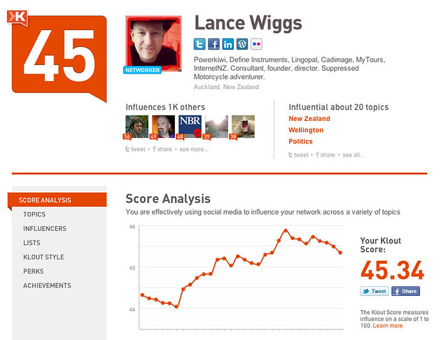
Klout purports to measure online influence. Apparently I’m worth 45.34, with those two decimals implying a degree of science beyond the measurement.

It’s all hogwash of course:

The problem with Klout is that a higher score is very often a measure of a higher level of painfulness for the rest of us. Higher scores can be generated from more followers, but also though more tweets and Facebook updates, more retweeting, cheerleading and other sometimes douchelike behaviors. It’s difficult to tell when a tweeter goes too far, but we all have our own internal standards, and choose not to follow when they are broken.

Klout is working on improving their measurement system, but for now it stays opaque and largely discredited by the tech community. However like it or hate it Klout dominates the personal social media measurement space for now, and people pay attention to it, sadly.

Enter Klouchebag, a site which did the rounds a few days ago. Klouchebag analyses your Twitter stream to see how annoying you are to fellow Twitter users. The site is a bit of fun, and is in response to Klout’s measurement flaws. It uses the ARSE rating system, measuring Anger, ReTweets, Social apps (like 4Square) and English usage. Here’s my score – apparently I’m a “bit of a prat”:

One nice thing about Klouchebag is that you don’t have to login to see your score. Tweets are public, so any site that demands a login to analyse your history should be rightfully treated with suspicion.

So is it possible to score highly on Klout and low on Douchebag? It was a wet Sunday, and I had plenty of other things to avoid doing, so here’s a handy chart for selected New Zealand tweeters. I pseudo-randomly picked names from the NZHerald and Computerworld lists and as well some from my own tweetstream. (Click on the chart it to see the enlarged version). Source data is here.

So what’s going on? Let’s add Klouchebag’s score descriptions to find out (and again click on the picture to see a larger version):

The left hand side, at the top, is the place to be – showing huge Klout and no douchebaggery. And right up there sits @rww, the twitter identity of ReadWriteWeb, started by Kiwi Richard  McManus. Richard’s own score is also high on Klout, but he is in the “A bit of a prat” Klouchebag ratings. He’s not at all like that, and this serves as a reminder that deeply analysing these scores, as I am doing,  is both meaningless and dangerous, although it is fun and can be insightful. @rww  is a broadcaster, spitting out tweets referring to ReadWriteWeb articles, while Richard’s tweets are more of a mixed bag – and more interesting for it. However that pushes him up the Klouchebag rankings.

Also on the far left side of the chart, though in territory accessible to mortals with only a NZ audience, are @theNBR, VodafoneNZ, @TelecomNZ, @BNZBank and @AsbBank. The NBR only tweets articles, and is a broadcaster for a website, just like @rww. Chris Keall, the man behind most NBR twitter action, is almost in the center of the chart – with a little  more Klout than @theNBR, but “a bit of a prat” along with Richard.

The four major corporations are all doing very well, delivering service without annoying people. Well done. TelecomNZ has more Klout, but is up in the “mostly alright” category. That should serve as a gentle warning that they may want to think about changing their approach. In general we see individuals associated with the big broadcasters and companies take a Douchebag hit, along with, one assumes, a Klout benefit from being associated with the big company.

But the best of the bunch are @barnaclebarnes, @robyngallagher, @jadetang123, @toxaq, @nikz, @gnat, @davidfarrier, @ri and @szechuan. It’s very hard to not be a star or broadcaster, and still manage the trick of influence and non-douchieness. I follow all these fine folks, and so should you. Their scores (and yes – this is all based on rubbish analysis I know) show that they are insightful and influential without being painful, and I concur.

Actually you should look to hire @Robyngallagher or @ri, engage @szechuan (Sacha from Buddle Findlay) as your legal advisor for technology, start-up and M&A work, use @gnat as your advisor on all things tech, give @barnaclebarnes money to keep growing  mytours, use @nikz’s 200square to sell your house, start something with @toxaq as your tech co-founder, try to keep up with @jadetang123, starting with Creative Mornings, and, well I don’t know @davidfarrier, but I suppose you should watch him on the news, if that’s your thing.

In short the K vs K chart has managed to filter some pretty awesome people out on the left hand side, which shows that something is working. Well done to everyone.

The mass in the middle are normal humans, and while we should take a little warning from the Klouchebag scores (I’m a “bit of a prat”), I would suggest that being under 40 is fine, and that between 40 and 50 is generally acceptable but one should think about moderating behavior.

Above 50 and things start getting interesting. @benkepes is up there, high in Klout and Klouchebag scores alike. Ben does tweet a lot, and a good chunk of it on stuff I am not that interested in. Perhaps the answer is to do as RWW and the corporations do, and separate the personal and professional accounts.

Twitter allows us to have lists, and while I generally follow NZ based humans back, I do have a private list of people who I more closely follow, while dipping into the firehouse now and then.  On that right hand side I was surprised to see that two or three (including Ben) on my private list. However a score above 50 could be considered as a hearty shot across the bows and taken as a warning. Or not – it’s all hogwash as I said.

So there you have it. The point of Twitter and these other social media tools is to have fun, to learn, to be part of a community, to help customers and each other and to not be a douchebag while doing it. Any help we can get to avoid douchebaggery is good, and we have all seen people change, to the benefit of the community. So if you feel you are drifting to the right, then perhaps lighten up a little. And if you are way over on the left hand side; stop gloating, these scores are all rubbish remember.

Boy for sale – partially

I just checked the iTunes NZ store, and sometime between my blog post last September and now, the movie Boy was placed on NZ’s iTunes store. Excellent.

Not so excellent is the price, and that when I opened the link somehow both the SD and HD versions of the movie started automatically downloading. I have no idea why – but these sorts of things tend to happen to me.

The other issue is that Boy is still not yet available on the US iTunes store, which is where the real market resides.

Our Far South – videos, photos and presentations

Over at OurFarSouth.org Rhian has published the summary presentations and videos that we have to date. First – the videos. They are pretty small – and it’s kinda fun to play them all at once.

King Penguins Eternally entertaining.

Elephant Seals The noises, oh the noises.

Sea Ice Thankfully not strong enough for the ship.

Southern Ocean and Antarctica Te Radar manages to upstage the actual Southern Ocean expert.

Next Stop: Antarctica Earlier in the journey

Then we have some very pretty presentations – lots of photos and coverage of the key issues we discussed. We were very lucky to have some superb scientists along for the voyage.
First up is Su Yin Khoo’s journey in pictures (none of these is really suitably small for dial-up or slow ADSL):
The journey in pictures

Next we have the key message slide packs by Geoff Simmons, with an assist from Su Yin and myself and some more stunning pictures.
OFS Summary Messages Introduction.pptx
OFS Summary Messages Climate Change.pptx
OFS Summary Messages Race for Resources.pptx
OFS Summary Messages Conservation & Wrap up.pptx

Finally we have some specialist presentations for schools, thanks to Judith McKendrey, John McCrystal, Sarah Wilcox and the second hardest working person on the trip – Rhian Salmon. The hardest working was Gareth Morgan – who of course put the whole trip together.

OFS_schools_presentation_generic.pptx
OFS Schools presentation.pptx
Notes for School Visits.docx

This scratches the surface of the lectures and work that we got through – if you would like to dive deeper into any of these topics then get in touch.

WordAds

I’ve just activated WordPress’s WordAds feature. Apparently we get to see some advertisements on this site and I get to earn $millions.

That won’t happen (the $millions bit), but I am interested in how this feature is implemented and what sort of advertisements are coming through. So if you see any ads – positive or negative -please let me know. I can’t see them yet myself.

Trade Me and Seek fight it out

trade me jobs, originally uploaded by LanceWiggs.

It’s pretty amazing looking at the Seek and Trade Me Jobs unique browsers stats. Neither site has managed to eke out an advantage.

I guess that means everyone is checking both sites, but also that advertisers would be wise to place ads on both sites as well. Each site will be trying to capture all of the market for job placements, and it’s clear that Seek is the defender here. At some stage Trade Me, as happened with real estate, will be clearly superior in listing quantity, and Seek’s relative market share will decline.

It’s somewhat astonishing that Seek’s site design looks like it hasn’t changed in 10 years.

Fixing supermarket self checkout

Buying your groceries at a supermarket is pretty simple – wait in a queue, hand your items over, pay for them, pick them up and go.

However the checkout counters are expensive, take up valuable space and only work when there are staff present. That makes it difficult to ramp up or down for demand, and, queues are generally required to make the costs economic.

Enter the supermarket self-checkout system. These take up a lot less space, but allow the shopper to avoid the queues and check out at a speed that they can control.

However it’s not so simple. The systems bought into lace, at least in NZ, are appallingly complex. From my experience the process is something like this:

The clearest demonstration of failure is at beginning, with the queue. An efficient checkout system would be able to take up all of the demand and remove the need for queues, as the Air New Zealand check-in kiosks do at local airports.

The experience of self-check out is vastly inferior to the traditional approach, especially given that almost all checkout operators I encounter are interesting, efficient and genuine. I generally prefer to avoid human interactions when making purchases, but the current state of play is just woeful.

The answer lies in trust. The supermarkets clearly don’t trust their customers, and the asinine scanning and weighing procedures slow the entire process to a crawl. The answer is to turn the tables, and place the onus of getting he checkout right on the customer, rather than trying to solve a potential issue with technology. Almost everyone is honest, especially in New Zealand, and a few tricks can increase compliance to essentially 100%.

Firstly, install cameras and discrete signs on the checkouts noting their use, and noting that failing to check something out is deemed as theft. Make the design of the kiosks open enough so that the customers can be observed from several directions by other shoppers and staff.

Secondly bring in a system of random audits, picking one in every 100, say, and doing so using the checkout itself rather than human selection. The audit will involve a team of two nearby who will check he contents of the bag against the receipt after checkout, and then give a coupon, discount or other small gift to everyone for their compliance. Treat non compliance as a mistake, unless obvious for high value items, but flag their credit card for future increased audits or potential banning from self-checkout.

Finally remove cash as an option for self checkout, which will remove the complex and breakable cash-acceptance equipment, and encourage the continuous transition to debit and credit cards. Accepting only plastic will also give the ability to retain more control, as well as offering the ability to link credit cards to loyalty cards and provide benefits.

Other options

Why not for now allow us to scan items as we shop, using an iPhone application or a portable scanner attached to the trolley. That we we can arrive at the checkout with the items already in a list, and perhaps we can even pay for them with our phone or with a credit card acceptor attached to the trolley.

Ultimately we should be able to lose the checkout process entirely, as each product can have an RFID tag, and your phone or wallet can contain a remote payment mechanism which is activated as you leave.

Calling Auckland Web design and development firms

I often get asked by small to large businesses for help in finding and selecting firms to design websites. While I know a few design firms, I suspect there are many that I have not met, and I don’t know enough about the ones I do know.

Over the next two weeks I’d like to visit selected web design and development firms in Auckland to meet the team, understand the way you go about your work, your preferred clients, see some of your results, and understand how your pricing model works. If you’d like to run your standard pitch at me then that would be great. If you like I can give feedback along the way, some of which may even be useful.

The goal is to end up with a short list of recommended teams for small, medium and large  clients.

If you’d like me to stop by, then please drop me a line at lance@lancewiggs.com.


Instagram, value and hard work

iPhone (and now Android) photo app developer Instagram just announced that they sold for US$1 billion of Facebook stock and cash. They have no revenue model. The free app allows iPhone owners to take photos and use various filters to make them look archaic and so forth, and became the cool thing to do. The photos can be (and it seems are generally)  uploaded to Instagram.

The three things I take away from this are

  1. This is a bubble investment. While arguably Facebook can monetise the vast Instagram user base by more tightly integrating the users into Facebook, the simple fact is they will spend $1 billion on a company with no revenue and just 12 staff. That’s great for the founders and investors, but doesn’t bode well for Facebook investors who will be buying into a company that spends money so freely.
  2. The value can disappear very quickly. While Instagram, until today, was cool, the ownership by Facebook, presence of, I’m guessing, thousands of other photo application and fickleness of the hipster-led market means that their user-base could disappear within months. It happened to MySpace after News Corp took over, and it will happen to Instagram under Facebook unless they are very clever. For my part – I no longer find Instagram style photos cool. That reflects the general passing of the faded photo fad, but this acquisition sounds the death knell.
  3. Easy money makes a nice story, but it’s not the path to real wealth. That path is, aside from a very few lucky stories, always the result of years of hard work building a genuine business that creates value for end users that they are willing to pay for. Please let’s not take the Instagram lesson as being that we can make $1 billion by building an iPhone app – we cannot.

Bank homepages in New Zealand – a review

Westpac NZ has launched a new website. They are using Silverstripe, so that means they can more rapidly make changes going forward.

That’s good, because the site itself is a mess:

There is far too much going on. If you want to, say, calculate how much a home loan would cost, then on mouse-over a huge sub-menu appears, and while you are pondering where to go next the scrolling display keeps flickering in the background. It’s all very frustrating.

But banks are marketing to younger people, looking for new accounts, mortgages and other financial products to take people in for life. Is this the required new norm perhaps?

I would argue no — and that this moveable clutter appeals to very few people, regardless of age. Perhaps the clutter is there to satisfy the needs of a large committee, each member of which wanted to make sure their favoured piece was on the home page. Perhaps each piece has been micro-analysed and user tested in the labs, in Edsel like fashion, missing the overall impression. In the real world the website (which is flickering in the background as I write this) is simply a mess.

I give Westpac’s homepage a 3/10.

What appeals to everybody is something like this:

Let’s not kid ourselves, a website like Apple’s for a large bank is almost impossible to produce. There are so many conflicting internal demands and politics.

So let’s be fair and quickly rate the other NZ bank site home pages.

BNZ’s homepage is good. I can see that that are wanting me to switch mortgage providers, and they provide a handy calculator right on the front page. I don’t care about the notebook competition, but the other links and menus seem to be obvious starting points for various actions. The menus do not thankfully, explode across the page when moused over. It feels professional, a little dated perhaps, but utilitarian and fairly safe. The login screen is lovely.

If they were really smart then they would remember that I’m a customer (albeit unlogged in), and tailor the home page to my needs.

Overall I give BNZ 7/10.

ANZ’s homepage looks good, better even than BNZ’s due to less clutter and more focus on the key desired action — checking out the home loans. It feels professional and crisp, fast and safe.

However with one sweep of the mouse it all falls apart in a screaming mess of menu expansion hell:

Wretchedly unusable. 4/10, but with strong potential to change as burying the appalling mouseover menus would transform the experience.

Kiwibank performs well. They clearly want me to learn more about their business accounts, and they clearly want me to check out their interest rates. The menus work as they should. Logging in is still somewhere else and ugly and despite the home page call to action, there is no way to sign up to a business account without talking to a human. That hasn’t worked well for them or me in the past.

It feels dated and non-transactional, competent but a webpage advertisement rather than a functional site for a bank. It feels more up to date than BNZ, say, but not as rigorous or trusted.

Overall it’s pretty bland, feeling static aside from the call to action itself, which is excellent. I give it a 6/10.

National Bank, which is getting ever closer to absorption by ANZ, has a competent website. The menus on the top are not from the ANZ expanding menu hell playbook, and the site is uncluttered and clear on the call to action.

Their login screen is stark, but had a little more design love than some others, albeit from back in 2003 or so. And that’s the feel of the homepage to me – dated, static and pretty boring. I’m not excited about joining up, and the reminder that switching home loans is not without cost isn’t a positive one.

5/10.

Wow. ASB is the only bank that understands that most people visiting the site are already customers. The login screen is front and center, and the call to action (the security alert) is obvious. Delete the alert and the login piece moves up, making for even less clutter.

For non customers ASB seems to recognise that they arrive at the site already motivated to check ASB out, and they guide these people down an “Experience ASB” path. Within 2 clicks I was reading a “how to switch” page which emphasizes that ASB does all of the hard work of switching. It’s fantastic, and they are not chasing low value customers who switch for lower rates, but are looking to form longer term relationships driven by better customer experiences.

To be fair the experience fell away a bit off the home page, but as this piece is only about the home pages I’m giving ASB a 9/10 and a “very well done”.

TSB’s site is not credible, and it needs to be a lot better than the others, as they start from a size and reputation disadvantage. They clearly want to lend or borrow money, but aside from the Facebook link offer the could be from 1998. There is no credibility, sense of trust or sense of depth of service. That’s a real shame as I’m sure they have a great story to tell.

2/10

The Co-operative Bank has some real issues. Their website looks still like the PSIS, their logo is in the wrong place and — well this just isn’t at all credible is it. This needs some serious decluttering and understanding of what their main purpose actually is. The CEO position is vacant (or it was a few weeks back), and fixing this should be high on her agenda.

1/10, but on the upside a huge opportunity for the new CEO to attack after she first walks in the customer and staff shoes for a bit.

Overall

It’s hard for banks, as they see that their customers and prospective customers have very different needs when they front up to the homepages. They have departments which are responsible for various parts of the business, and each wants the chance to reach customers from the home page.

But they should all, excluding ASB, take a big step back, and ask themselves why they exist as a bank, who visits the website, and what they want them to do.

Most visitors will be customers, so why not get them logged in and working as quickly as possible? Why not drop a cookie or two so that you know when a customer returns, and what products to put in front of them as they login? And why not concentrate on what prospective customers really want — an easy way to get out of their current awful banking experience.

Walking in the customer shoes is the first thing the new Co-operative Bank CEO needs to do, but it’s also something that every other bank executive should also constantly be doing. Come and visit people in their homes, at work and on the road, and understand how your customers use your service. Drive the required change from the top, and get everyone else out there experiencing how it is.

ASB seems to have done some of this — understanding that high switching costs are the main barrier to switching, not prices. They understand that the ASB website is primarily for customers, not prospective customers. They undersand that we don’t want to think and get lost in clutter when we head to a bank home page.

Banks largely have customers for life, and so it’s been a while since I saw many of these screens (I’m with BNZ). However while the front pages of the larger banks are full of glitz and glam, examining the login screens felt like a peek behind the curtain about what the customer experience is really like — and it wasn’t pretty.

Here are the personal login screens for each bank in order of my feeling for their quality. I’ve also shown the homepage scores from above. Check them out — which bank would you rather be with?

Coop bank scored 1/10 for their homepage

TSB scored 2/10 for their homepage

Westpac scored 3/10 for their homepage

Kiwibank scored 6/10 for their homepage

National Bank scored 5/10 for their homepage

ANZ scored 4/10 for their homepage

BNZ scored 7/10 for their homepage

ASB scored 9/10 for their homepage

This wasn’t preordained. I rated the bank homepages as I saw them, and separately sorted the login screens. It’s not at all surprising that the order is almost exactly the same though, as the ability to understand and meet customer needs is the underlying factor behind both efforts.

ASB is the only bank that demonstrates that they know what customers want, and their site really did genuinely surprise me on first visit. Some of the other banks seem trapped behind their own internal counters and systems, and really are missing the point as far as we customers are concerned.

However while there is plenty of room for improvement, the required change isn’t as simple as a website team project — it needs to come from the top, and it needs company-wide alignment around a customer cause.

The resolution war is coming

I wrote an early version of this in response to a Hacker News piece on the next generation of video games.

There is an increasingly clear picture of the future of TV screens. Ever higher resolution.

TV manufacturers are currently delivering quality HDTV 1080P sets in volume and at low prices. Nobody can really get out of a commodity play, and even the largest screens are unable to command premium prices.

The 3D diversion

The manufacturers have been trying to convince us to care about 3DTV, but the 3D gig is up. We collectively just don’t care about the 3D fad. The biggest issue is that we increasingly watch TV alongside other activities, such as surfing the internet, reading or talking. It’s hard to switch in and out of a 3D experience while multi-tasking, whether you use glasses or not. It speaks volumes that the biggest grossing film of the year, The Hunger Games, wasn’t delivered in 3D, and that “available in 3D” is becoming, for me at least, a sign of a truly crappy movie.

The other issue is 3D content and content delivery – there is (thankfully) not enough of the first, and poor means for the second. We are increasingly receiving our TV content over the internet, but even there we can’t see much of anything 3D.

HD Content
Apple and Netflix, at least, are delivering up lovely HD 1080P content already, which matches the highest available TV screen resolutions. It’s an even match between content delivery and TV manufacturers right now, but Apple and Netflix have a huge advantage over time. They are using the internet to deliver content, and end to end internet speeds are on a continuous growth curve. Pretty soon they will be offering much higher resolutions, well beyond the maximum HD resolution of 1080P, and there is no reason to believe this resolution race will stop in the next decade. This time there does not need to be an endless squabble about HDTV broadcast standards, as the delivery will be through IP, and TVs will, just like your computer, be able to accept a variety of input types. They’ll be software and perhaps hardware upgradeable so new video standards can be adopted.

High Resolution TV
To match this content we need ever increasing higher resolution TV screens, eventually delivering an IMAX experience in the home. Later on we’ll see lower prices, touch and eventually iPad functionality on our walls.

Apple is rumoured to be entering the TV market, and we know it won’t be with a me-too commodity product. So why wouldn’t they launch with a higher resolution screen? Why wouldn’t they match the experience of the iPhone and iPad 3? Apple will be able to keep controlling the delivery of media through the Apple TV (built in or not), and, with the iPad already in the lounge, gaming on the higher resolution TV is essentially ready to go. TV manufacturers are surely expecting this.

So get ready for a resolution war, and the players will be the content owners (MPAA), the content delivery owners (Sky, Comcast etc), the ISPs and the television manufacturers. There are a couple of candidates for the weakest link in that mix, but my money is on Apple to be the first to tie it all together in  compelling way. The TV screen has moved well beyond the broadcast era already, and with Apple it could be a seamless extension of the TV, iPad, iPhone and your computer.

Gaming devices
The next generation gaming devices (XBox, PSx, Wii) had better launch alongside new higher resolution TVs (Sony can do this), perhaps higher resolution new movie content and with stunningly detailed graphics. If not we will rightly yawn at their arrival and stick with our computers, iPads and iPhones.

Heck – if Sony, Nintendo & Microsoft continue with their very slow release cycles for the gaming machines, then the next generation of video game devices may well be the last – and we’ll be driving big screen games using iPads and other tablets.

Rate iTunes apps out of four not five


iTunes, originally uploaded by LanceWiggs.

This is the Apple customer feedback for the Twitter iOS app. The app itself is wretched, which is why I joined many others and switched to the admirable Tweetbot.

So does 2.5 stars out of 5 mean the app is rated well by half the customers and badly by the other half?

Not at all. The lowest possible rating for apps is one star, not zero stars, so the average score is not 2.5 out of 5, but 1.5 out of 4.

There’s a trick to see through the deception though. If you cover up the left hand star in the red average rating then the truth will be revealed.