Wotif have launched a new site – Wotflight. It only applies only to Australian flights for now, but it is certainly worth a look.
I like the simple approach, and there are some nice user interface elements.

Looks great doesn’t it? Clearly there has been a good designer involved.
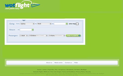
I went ahead and tried to book a flight. However I failed on the first page trying to search for a one-way flight Sydney to Perth.

That’s when I noticed the large “one way” and “return” tabs on the top left. They seem to be on most airline’s sites, but I contend that they should be history by now. If I don’t want a return flight then why can I not just leave the date empty? Alternatively (and additionally) why not give me a click-box?
While we are at it the return date is in a strange place – why not move it over under the outward date?
So I’ve had a go at editing the home page it to remove everything that is not required. What do you think?

You could remove even more if you try. I’m guessing the designer was told what to put in, and that the usability person didn’t have much say.
The results page has also been designed – and is stunning looking.

It’s quite a lot to take in, but I found it easy enough to navigate. It shows all the options on one page – from flight times and durations to seat types and costs.
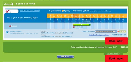
Click on “select” under a ticket and you come to the buy summary page. It is not too bad:

However once again while it looks nice, some improvement is required. Here’s the really obvious one:

and there is plenty more to do on that page. So let’s look at the next, payment page:

Scary. It’s lovely to look at in one sense, but simply too scary in another. My hypothesis with the site is that it was done by some pretty good designers, but it was not user tested very much, if at all, and it was subject to some constraints by a business person.
But then – I’m just one more user.
Overall – a good launch effort, but the real work starts now in the daily tweaking.








 Lance Wiggs